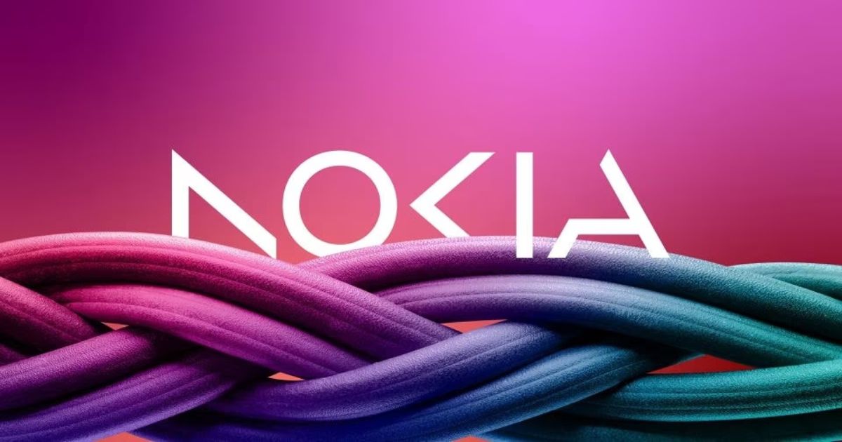
Gone are the days when we can see Nokia’s iconic typeface and “Yale blue” logo. For the first time in almost 60 years, the telecommunications equipment maker changed its logo, which now features five different shapes that spell out NOKIA. The company has now adopted a look that it claims is more modern and digital.
Before the official start of the Mobile World Congress in Barcelona, Nokia unveiled its plans to change its brand identity.
“There was the association to smartphones and, nowadays, we are a business technology company,” Chief Executive Pekka Lundmark said in an interview with Reuters.
The company’s focus has now shifted to selling gear to other companies, as well as continuing to target growth for its service provider business.
According to a Reuters report, leading technology companies have been “partnering with telecom gear makers such as Nokia to sell private 5G networks and gears for automated factories to customers, mostly in the manufacturing sector.”
Moving forward, the brand looks to study the growth path of its different departments and consider various options when it comes to making decisions and action plans for the business.
Reuters also stated that its direction on factory automation and data centers could see them “locking horns” with tech giants like Microsoft and Amazon.


